Table of Contents
Introduction: Streamlining Your Scheduling with Our Appointment Form in HTML and CSS:
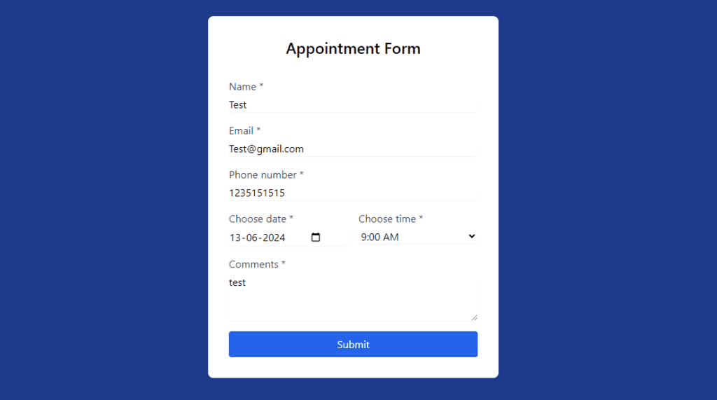
In our digitally-driven era, efficiency is not just an asset; it’s a necessity. This is especially true for businesses where appointment scheduling is a daily task. We’ve crafted a user-friendly appointment form designed to seamlessly integrate into your website. Our form, powered by the sleek Tailwind CSS, ensures that your clients can book their appointments without hassle. With a focus on simplicity and style, this form is tailored to elevate your client’s experience and fit effortlessly into your site’s aesthetic.
HTML Code: The Backbone of Your Form:
Every robust web form starts with clean, well-structured HTML. Here’s the blueprint for our appointment Form in HTML and CSS:
 //Form in HTML and CSS
<div class="bg-white rounded-lg p-8 w-full max-w-md">
    <h2 class="text-2xl font-semibold text-center mb-8">Appointment Form</h2>
    <form class="space-y-4">
      <label class="block">
        <span class="text-gray-700">Name *</span>
        <input type="text" class="form-input mt-1 block w-full rounded-md border-gray-300 shadow-sm" placeholder="Enter your name...." required>
      </label>
      <label class="block">
        <span class="text-gray-700">Email *</span>
        <input type="email" class="form-input mt-1 block w-full rounded-md border-gray-300 shadow-sm" placeholder="Enter your mailId..." required>
      </label>
      <label class="block">
        <span class="text-gray-700">Phone number *</span>
        <input type="tel" class="form-input mt-1 block w-full rounded-md border-gray-300 shadow-sm" placeholder="phoneNumber" required>
      </label>
      <div class="flex gap-4">
        <label class="block flex-1 input-with-icon">
          <span class="text-gray-700">Choose date *</span>
          <input type="date" class="form-input mt-1 block w-full rounded-md border-gray-300 shadow-sm" required>
          <i class="fas fa-calendar date-icon text-gray-500"></i>
        </label>
        <label class="block flex-1">
          <span class="text-gray-700">Choose time *</span>
          <select class="form-select mt-1 block w-full rounded-md border-gray-300 shadow-sm" required>
            <option>9:00 AM</option>
            <option>10:00 AM</option>
            <option>11:00 AM</option>
            <!-- More times here -->
          </select>
        </label>
      </div>
      <label class="block">
        <span class="text-gray-700">Comments *</span>
        <textarea class="form-textarea mt-1 block w-full rounded-md border-gray-300 shadow-sm" rows="3" placeholder="Enter comments here..." required></textarea>
      </label>
      <button type="submit" class="w-full bg-blue-600 text-white py-2 rounded hover:bg-blue-700 focus:outline-none focus:ring-2 focus:ring-blue-500 focus:ring-opacity-50">Submit</button>
    </form>
  </div>
// Form in HTML and CSS
Incorporate this code into the body of your website’s HTML where you want the form to appear.
CSS Code: Styling Your Form
To ensure the form is not just functional but also visually appealing, here’s the custom CSS you’ll need:
<style>
  /* Tailwind doesn't have built-in styles for a date picker icon, so custom styles are used */ Form in HTML and CSS
  .date-icon {
    position: absolute;
    right: 10px;
    top: 10px;
    z-index: 10;
    pointer-events: none;
  }
  .input-with-icon {
    position: relative;
  }
  .input-with-icon input[type="date"] {
    padding-right: 2.5rem;
  }
</style>
Add this snippet to your CSS file or within a <style> tag in the <head> section of your HTML.
Complete Code:
Below is the complete HTML, CSS code. Replace the placeholders with your actual data handling mechanisms and styles.
<!DOCTYPE html>
// Form in HTML and CSS
<html lang="en">
<head>
<meta charset="UTF-8">
<meta name="viewport" content="width=device-width, initial-scale=1.0">
<title>Appointment Form</title>
<script src="https://cdn.tailwindcss.com"></script>
<style>
  /* Tailwind doesn't have built-in styles for a date picker icon, so custom styles are used */
  .date-icon {
    position: absolute;
    right: 10px;
    top: 10px;
    z-index: 10;
    pointer-events: none;
  }
  .input-with-icon {
    position: relative;
  }
  .input-with-icon input[type="date"] {
    padding-right: 2.5rem;
  }
</style>
</head>
<body class="bg-blue-900 flex items-center justify-center h-screen p-4">
  <div class="bg-white rounded-lg p-8 w-full max-w-md">
    <h2 class="text-2xl font-semibold text-center mb-8">Appointment Form</h2>
    <form class="space-y-4">
      <label class="block">
        <span class="text-gray-700">Name *</span>
        <input type="text" class="form-input mt-1 block w-full rounded-md border-gray-300 shadow-sm" placeholder="Enter your name...." required>
      </label>
      <label class="block">
        <span class="text-gray-700">Email *</span>
        <input type="email" class="form-input mt-1 block w-full rounded-md border-gray-300 shadow-sm" placeholder="Enter your mailId..." required>
      </label>
      <label class="block">
        <span class="text-gray-700">Phone number *</span>
        <input type="tel" class="form-input mt-1 block w-full rounded-md border-gray-300 shadow-sm" placeholder="phoneNumber" required>
      </label>
      <div class="flex gap-4">
        <label class="block flex-1 input-with-icon">
          <span class="text-gray-700">Choose date *</span>
          <input type="date" class="form-input mt-1 block w-full rounded-md border-gray-300 shadow-sm" required>
          <i class="fas fa-calendar date-icon text-gray-500"></i>
        </label>
        <label class="block flex-1">
          <span class="text-gray-700">Choose time *</span>
          <select class="form-select mt-1 block w-full rounded-md border-gray-300 shadow-sm" required>
            <option>9:00 AM</option>
            <option>10:00 AM</option>
            <option>11:00 AM</option>
            <!-- More times here -->
          </select>
        </label>
      </div>
      <label class="block">
        <span class="text-gray-700">Comments *</span>
        <textarea class="form-textarea mt-1 block w-full rounded-md border-gray-300 shadow-sm" rows="3" placeholder="Enter comments here..." required></textarea>
      </label>
      <button type="submit" class="w-full bg-blue-600 text-white py-2 rounded hover:bg-blue-700 focus:outline-none focus:ring-2 focus:ring-blue-500 focus:ring-opacity-50">Submit</button>
    </form>
  </div>
  <!-- Font Awesome Kit -->
  <script src="https://kit.fontawesome.com/your-fontawesome-kit.js"></script>
</body>
</html>
// Form in HTML and CSS
Conclusion: Enhancing Your Website Functionality
By implementing this appointment form, you’re not just streamlining your scheduling process; you’re upgrading your website’s functionality. Our form is responsive across devices, thanks to the mobile-first approach of Tailwind CSS, and it harmonizes with the modern web’s demand for speed and elegance.
Before you launch, make sure to conduct a thorough test of the form on your website. This ensures every element functions as expected and that your clients enjoy a frictionless experience from start to finish.
Remember, in the digital age, your website is often your first impression. Make it count with a form that’s as efficient as it is inviting.
If you want to download the project. Click Here: Github
Explore more:
-> Create A Login Registration and Forgot Password Form In HTML CSS and JavaScript.
-> Creating Responsive Login and Registration Form in Html CSS and JavaScript with Validations.
-> Create a Stunning Tailwind CSS Registration Form with HTML and JavaScript Validation.
-> Creating a Responsive Login and Signup Form in React.js
-> Building a Dynamic Login and Registration Form in React.js
-> Ultimate Login and Registration Form in HTML CSS and JavaScript with Flawless Validations


1 Comment
Pingback: Building a Responsive Registration Form : A Step-by-Step HTML CSS and JS Guide - Tech Masters Lab